The Value of Logo Design
Often times clients come to us and inquire about logo design. More often that not, they fall into 2…

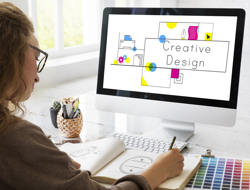
Often times clients come to us and inquire about logo design. More often that not, they fall into 2…
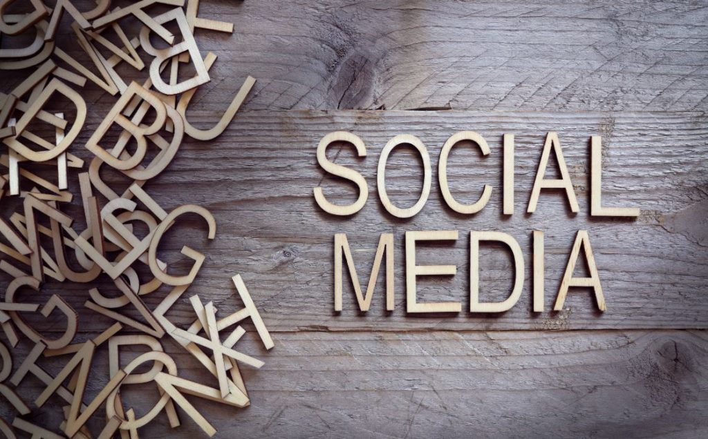
Let’s start with one simple fact: your business needs a social media presence. Whether you run a local donut…
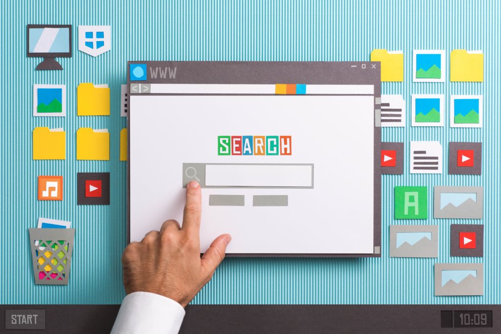
Remember when you were a kid and you always wanted to be first? First in line, first place, first…